Property Pane Components
Reference for all Property Pane UI components used to configure widget settings in the editor
Property Pane Components
Property Pane components define the editor UI for configuring widget components. Each component maps to a specific data type and generates the corresponding editor controls.
How to Use This Reference
- Find the component that matches your data type
- Copy the model example
- Customize
propPathandparamsfor your component
Quick Reference
| Component | Data Type | Use Case |
|---|---|---|
| TEXT_INPUT | string | Text fields, placeholders |
| NUMBER_INPUT | number | Counters, limits |
| SWITCH | boolean | Feature toggles |
| SELECT | any single value | Enum choices |
| RADIO_BUTTONS | any single value | Enum choices (visible options) |
| DATEPICKER | ISO date string | Date/time selection |
| COLOR_SELECT | rgba string | Color pickers |
| SIZE | object | Width/height controls |
| INDENTATION | object | Padding/margin controls |
| ALIGNMENT | object | Flexbox layout controls |
| BACKGROUND | object | Color/gradient/image |
| BORDERS | object | Border style/width/color |
| BOX_SHADOW | object | Shadow settings |
| BORDER_RADIUS | object | Corner radius |
| TEXT_PARAMS | object | Typography settings |
| INPUT_VALIDATION | object | Form validation |
| INPUT_LABEL | object | Label position/visibility |
| IMAGE_SOURCES | object | Image URL selection |
| COUNTRY_PHONE_SELECT | object | Phone country code |
| HOVER_ANIMATION | object | Hover state styles |
| ACTIONS | array | Click handlers |
| DISPLAY | string | Visibility control |
| COMPONENT_OPTIONS | object | Dropdown/radio options |
| ICON_SELECT | object | Icon picker |
| LIST_POSITION | object | List layout direction |
| INSERT_BLOCK | - | Links/merge tags in text |
| PRIZE_SETTINGS | object | Gamification prizes |
Basic Components
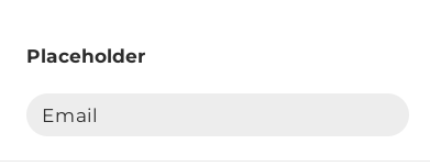
Text Input
A text field with the ability to set a label, placeholder, description, and validators.
Model example:
{
  "type": "CONTROL",
  "name": "TEXT_INPUT",
  "propPath": [
    "content",
    "placeholder"
  ],
  "params": {
    "label": "Placeholder",
    "validators": {
      "required": true
    }
  }
}
Component works with the following data: string
Data example: "text", "123"
Full reference: Text input
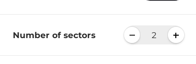
Number Input
An input field dedicated to numbers.
Model example:
 {
  "type": "CONTROL",
  "name": "NUMBER_INPUT",
  "propPath": [
  "content",
    "numberOfSectors",
  ],
  "params": {
    "label": "Number of sectors",
    "validators": {
      "min": 0,
      "max": 10
    },
  }
}
Component works with the following data: number
Data example: 123
Full reference: Text input
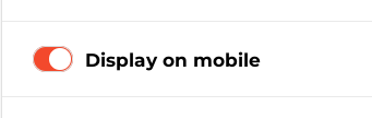
Switch Toggle
A control for selecting a boolean value, which can optionally be mapped to any two values.
Model example:
{
  "type": "CONTROL",
  "name": "SWITCH",
  "propPath": [
    "content",
    "displayOnMobile"
  ],
  "params": {
    "label": "Display on mobile"
  }
}
Component works with the following data: boolean
Data example: true, false
Full reference: Switch toggle
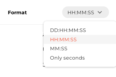
Dropdown Select
A dropdown select with the ability to set a custom menu width.
Model example:
{
  "type": "CONTROL",
  "name": "SELECT",
  "propPath": [
    "content",
    "choice",
  ],
  "params": {
    "label": "Format",
    "options": [
      {
        "label": "HH:MM:SS",
        "value": "format1"
      },
      {
        "label": "DD:HH:MM:SS",
        "value": "format2"
      }
    ]
  }
}
Component works with the following data: any single value
Data example: "text", 123
Full reference: Dropdown select
Radio Buttons
Similar to dropdown select but with a different UI for selecting options.
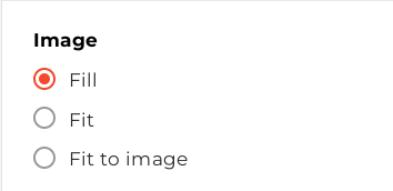
Model example:
 {
  "type": "CONTROL",
  "name": "RADIO_BUTTONS",
  "elementProp": "styleAttributes",
  "elementSubProp": "objectFit",
  "element": "image",
  "params": {
    "label": "Image",
    "options": [
      {
        "label": "Fill",
        "value": "cover"
      },
      {
        "label": "Fit",
        "value": "contain"
      },
      {
        "label": "Fit to image",
        "value": "none"
      }
    ]
  }
}
Component works with the following data: any single value
Data example: "text", 123
Full reference: Radio buttons
Datepicker
A date and time picker with the ability to select date only and apply validators.
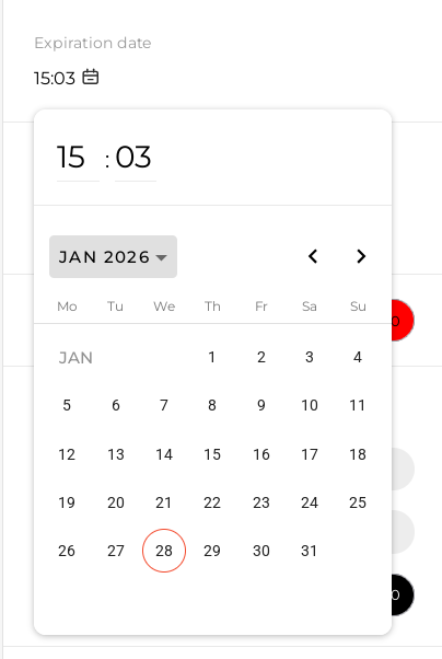
Model example:
{
  "type": "CONTROL",
  "name": "DATEPICKER",
  "propPath": [
    "content",
    "expirationDate"
  ],
  "params": {
    "label": "Expiration date",
    "showTime": true
  }
}
Component works with the following data: date string in YYYY-MM-DDTHH:mm:ss.SSSZ or YYYY-MM-DDTHH:mm:ss format
Data example: 2026-01-15T11:12:00.000Z, 2026-01-15T13:12:00
Full reference: Datepicker
Color Picker
A color picker with the ability to select a solid color (non-gradient).
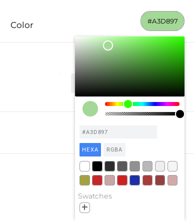
Model example:
 {
  "type": "CONTROL",
  "name": "COLOR_SELECT",
  "propPath": [
    "content",
    "color"
  ],
  "params": {
    "label": "Color"
  }
}
Component works with the following data: rgb or rgba string
Data example: rgba(171, 106, 106, 1)
Full reference: Color picker
Text
Displays any text for descriptions or informational purposes.
Model example:
 {
  "type": "TEXT",
  "params": {
    "text": "Example of text",
    "type": "SECONDARY"
  }
}
Full reference: Text
Group
Groups components to display different settings for desktop and mobile.
The editor displays settings corresponding to the environment the user is editing.
Model example:
[
  {
    "type": "GROUP",
    "propPath": [
      "adaptiveStyles",
      "desktop"
    ],
    "children": [
      {
        "type": "CONTROL",
        "name": "SIZE",
        "element": "host",
        "elementProp": "styleAttributes",
        "params": {
          "width": {
            "options": [
              "fixed",
              "fill"
            ],
            "minValue": 200,
          }
        }
      }
    ]
  },
  {
    "type": "GROUP",
    "propPath": [
      "adaptiveStyles",
      "mobile"
    ],
    "children": [
      {
        "type": "CONTROL",
        "name": "SIZE",
        "element": "host",
        "elementProp": "styleAttributes",
        "params": {
          "width": {
            "options": [
              "fixed",
              "fill"
            ],
            "minValue": 100,
          }
        }
      }
    ]
  }
]
In this example, the size component has different minValue values for desktop and mobile.
Full reference: Group
Prebuilt Components
Size
Controls the component's height and width. You can restrict the options available for each control or disable one of the controls.
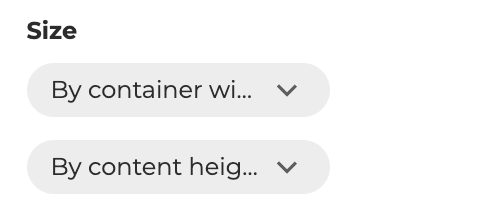
Model example:
{
  "type": "CONTROL",
  "name": "SIZE",
  "element": "host",
  "elementProp": "styleAttributes",
  "params": {
    "width": {
      "options": [
        "fixed",
      ]
    },
    "height": {
      "options": [
        "fill",
        "hug"
      ]
    }
  }
}
Component works with the following data:
{
  width: string;
  minWidth: string | null;
  height: string;
  minHeight: string | null;
}
Data example:
{
  "width": "150px",
  "minWidth": "150px",
  "height": "auto",
  "minHeight": null
}
Full reference: Size
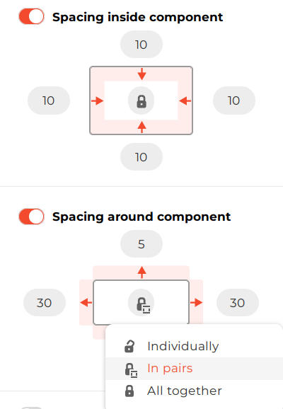
Indentation
There are two types of indentation: padding and margins.
There are also three modes for syncing values across different sides:
- Same value for all sides
- Sync horizontal and vertical indentation separately
- No sync — each side can have a different value
Model example:
{
  "type": "CONTROL",
  "name": "INDENTATION",
  "elementProp": "styleAttributes",
  "element": "text",
  "params": {
    "indentationType": "PADDING"
  }
}
Component works with the following data for padding:
{
  paddingTop: string,
  paddingBottom: string;
  paddingLeft: string;
  paddingRight: string;
  _paddingEnabled: boolean;
}
Data example for margin:
{
  "marginTop": "0px",
  "marginBottom": "5px",
  "marginLeft": "0px",
  "marginRight": "25px",
  "_marginEnabled": false
}
Note: _marginEnabled / _paddingEnabled can be false even when sides have non-zero values.
This is used to preserve values when the user turns off the indentation toggle.
Full reference: Indentation
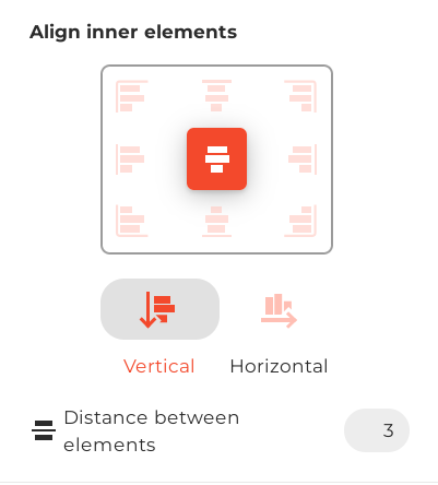
Alignment
This control sets the flexDirection, justifyContent, alignItems, and gap CSS properties.
Model example:
{
  "type": "CONTROL",
  "name": "ALIGNMENT",
  "elementProp": "styleAttributes",
  "element": "host"
}
Component works with the following data:
{
  flexDirection: string;
  justifyContent: string;
  alignItems: string;
  gap: string;
}
Data example:
{
  "flexDirection": "column",
  "justifyContent": "center",
  "alignItems": "center",
  "gap": "10px"
}
Doesn't have additional parameters.
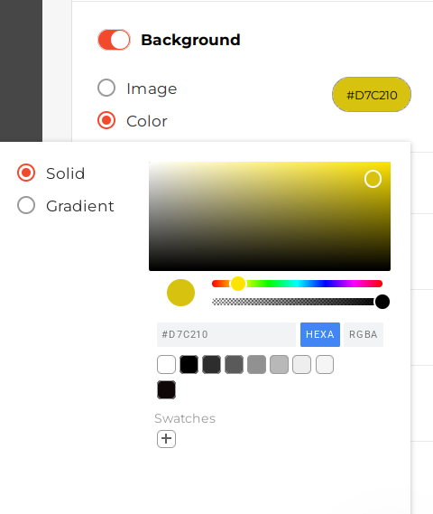
Background
Allows selection of a solid color, gradient, or image. Some options can be disabled.
Model example:
{
  "type": "CONTROL",
  "name": "BACKGROUND",
  "elementProp": "styleAttributes",
  "element": "host"
}
Component works with the following data:
{
  background: string;
  externalBackgroundUrlSource: boolean;
}
Notes:
backgroundcan be named differently usingparams.propertyexternalBackgroundUrlSourceindicates that the user manually entered an image URL. For the image to load, it must allow cross-origin requests via CORS
Data examples:
{
  background: "rgba(143, 81, 81, 1)",
  externalBackgroundUrlSource: false
}

{
  background: 'url("https://...") center center / cover no-repeat',
  externalBackgroundUrlSource: false

}
Full reference: Background
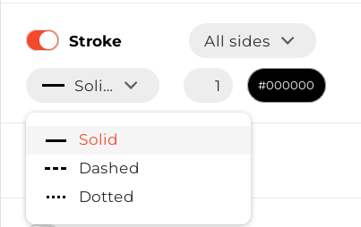
Borders
Allows setting border style, width, and color for all sides at once or for each side separately.
Model example:
{
  "type": "CONTROL",
  "name": "BORDERS",
  "propPath": [
    "styles",
    "[element=host]",
    "styleAttributes"
  ]
}
Component works with the following data:
{
  borderBottomColor: string;
  borderBottomStyle: string;
  borderBottomWidth: string;
  borderLeftColor: string;
  borderLeftStyle: string;
  borderLeftWidth: string;
  borderRightColor: string;
  borderRightStyle: string;
  borderRightWidth: string;
  borderTopColor: string;
  borderTopStyle: string;
  borderTopWidth: string;
}
Data example:
{
  borderBottomColor: "rgb(0, 0, 0)",
  borderBottomStyle: "solid",
  borderBottomWidth: "1px",
  borderLeftColor: "rgb(0, 0, 0)",
  borderLeftStyle: "solid",
  borderLeftWidth: "1px",
  borderRightColor: "rgb(0, 0, 0)",
  borderRightStyle: "solid",
  borderRightWidth: "1px",
  borderTopColor: "rgb(0, 0, 0)",
  borderTopStyle: "solid",
  borderTopWidth: "1px"
}
Full reference: Borders
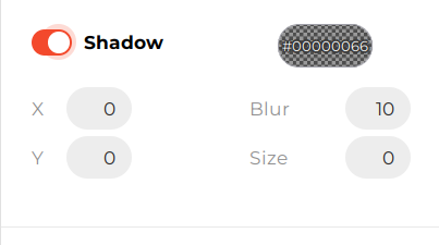
Box Shadow
Configures shadow size, blur, and offsets.
Model example:
{
  "type": "CONTROL",
  "name": "BOX_SHADOW",
  "propPath": [
    "styles",
    "[element=host]",
    "styleAttributes"
  ]
}
Component works with the following data:
{
  boxShadow: string;
}
Data example:
{
  boxShadow: "0px 4px 20px 0px rgba(0, 0, 0, 0.25)"
}
Doesn't have additional parameters.
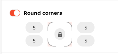
Border Radius
Sets border radius for all corners separately or at once.
Model example:
{
  "type": "CONTROL",
  "name": "BORDER_RADIUS",
  "propPath": [
    "styles",
    "[element=host]",
    "styleAttributes"
  ]
}
Component works with the following data:
{
  borderBottomLeftRadius: string;
  borderBottomRightRadius: string;
  borderTopLeftRadius: string;
  borderTopRightRadius: string;
}
Data example:
{
  borderBottomLeftRadius: "5px",
  borderBottomRightRadius: "5px",
  borderTopLeftRadius: "0px",
  borderTopRightRadius: "0px"
}
Doesn't have additional parameters.
Text Styles
Text styles include font family, size, weight, spacing, alignment, and more.
Users can focus on different elements inside the component, and the Text styles control will display the corresponding settings.
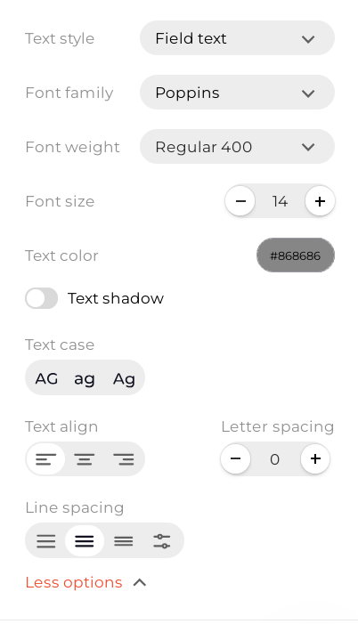
Model example:
{
  "type": "CONTROL",
  "name": "TEXT_PARAMS",
  "params": [
    {
      "element": "text",
      "isLineSpaceAvailable": true,
      "isTextTransformAvailable": true
    }
  ]
}
Component works with the following data:
{
  color: string;
  fontFamily: string;
  fontSize: string;
  fontWeight: string;
  letterSpacing: string;
  lineHeight: string;
  textAlign: string;
  textShadow: string;
  textTransform: string;
}
Data example:
{
  color: "rgba(0, 0, 0, 1)",
  fontFamily: 'Poppins',
  fontSize: "25px",
  fontWeight: "600",
  letterSpacing: "0px",
  lineHeight: "120%",
  textAlign: "center"
  textShadow: "none",
  textTransform: "none"
}
If the user chooses to use a Text style (first control in the screenshot), all described fields will be moved to document.shared.textClasses[TEXT_CLASS_ID]
and a classes field with TEXT_CLASS_ID will be added to the active component's element.
Classes example:
{
  element: 'text',
  styleAttributes: {},
  classes: 'TEXT_CLASS_ID'
}
Full reference: Text styles
Input Validation
Displays validation controls and supporting text.
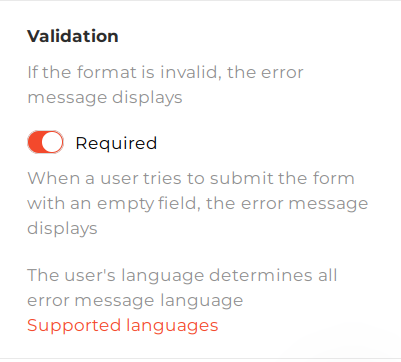
Model example:
{
  "type": "CONTROL",
  "name": "INPUT_VALIDATION",
  "params": {
    "validationPropPath": ["control", "validation"],
    "required": true
  }
}
Component works with the following data:
{
  required: boolean;
}
Data example:
{
  required: true
}
Full reference: Input validation
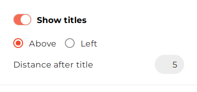
Input Label
Controls label display and position.
Model example:
{
  "type": "CONTROL",
  "name": "INPUT_LABEL",
  "propPath": [
    "styles",
    "[element=label]",
    "params"
  ]
}
Component works with the following data:
{
  enabled: boolean;
  position: PropertyPaneInputLabelPosition;
  margin: number;
}

enum PropertyPaneInputLabelPosition {
  TOP = 'TOP',
  LEFT = 'LEFT',
}
Data example:
{
  enabled: true,
  position: 'TOP',
  margin: 5,
}
Doesn't have additional parameters.
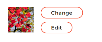
Image Source
Shows a preview of the selected image while allowing selection of another image or editing of the existing one.
Model example:
{
  "type": "CONTROL",
  "name": "IMAGE_SOURCES",
  "element": "image",
  "propPath": [
    "control",
    "imageSource"
  ]
}
Component works with the following data:
{
  url: string;
  externalSource: boolean;
}
Note: externalSource indicates that the user manually entered an image URL. For the image to load, it must allow cross-origin requests via CORS.
Data example:
{
  url: 'https://example.com/image.png'
  externalSource: true
}
Doesn't have additional parameters.
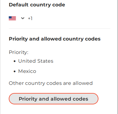
Country Phone Select
Controls the default country code and manages the list of available country codes.
Model example:
 {
  "type": "CONTROL",
  "name": "COUNTRY_PHONE_SELECT",
  "element": "input",
  "propPath": [
    "control"
  ]
}
Component outputs following data:
{
  countryCode: string;
  countriesPriority: WidgetCountryCodesPriorityConfigI;
}

interface WidgetCountryCodesPriorityConfigI {
  includedList: string[];
  allowToAddOnlyFromIncludedList: boolean;
}
Data example:
{
  "countryCode": "US",
  "countriesPriority": {
    "includedList": [
      "US",
      "MX"
    ],
    "allowToAddOnlyFromIncludedList": false
  }
}
Doesn't have additional parameters.
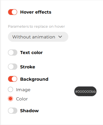
Hover Animation
Configures background, text color, shadow, and border changes for hover effects.
Model example:
{
  "type": "CONTROL",
  "name": "HOVER_ANIMATION",
  "propPath": [
    "styles",
    "[element=button]",
    "hoverStyleAttributes"
  ],
  "params": {
    "animationTypeProp": {
      "propPath": [
        "styles",
        "[element=button]",
        "hoverAnimationType"
      ]
    }
  }
}
Component outputs following data:
{
  background: string;
  borderBottomColor: string;
  borderBottomWidth: string | undefined;
  borderLeftColor: string;
  borderLeftWidth: string | undefined;
  borderRightColor: string;
  borderRightWidth: string | undefined;
  borderTopColor: string;
  borderTopWidth: string | undefined;
  boxShadow: string | null;
  color: string | undefined;
  externalBackgroundUrlSource: boolean;
}
Data example:
{
  background: "rgba(0, 0, 0, 0.73)"
  borderBottomColor: "rgba(255, 230, 100, 0)"
  borderBottomWidth: undefined
  borderLeftColor: "rgba(255, 230, 100, 0)"
  borderLeftWidth: undefined
  borderRightColor: "rgba(255, 230, 100, 0)"
  borderRightWidth: undefined
  borderTopColor: "rgba(255, 230, 100, 0)"
  borderTopWidth: undefined
  boxShadow: null
  color: undefined
  externalBackgroundUrlSource: false
}
Full reference: Hover animation
Actions
Sets click actions such as Open URL, Close Widget, or Form Submit.
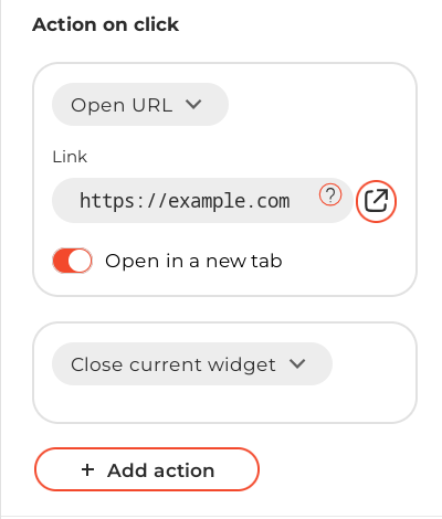
Model example:
 {
  "type": "CONTROL",
  "name": "ACTIONS",
  "propPath": [
    "handlers"
  ],
  "params": {
    "origin": true
  }
}
Data example:
{
  props: {
    "handlers": [
      {
        "type": "CLICK",
        "actions": [
          {
            "type": "OPEN_LINK",
            "params": {
              "link": "https://example.com",
              "target": "_blank",
            },
          },
          {
            "type": "CLOSE_WIDGET",
            "params": {}
          }
        ]
      }
    ]
  }
}
Full reference Actions
Display
Controls the visibility of the component depending on the desktop or mobile environment.
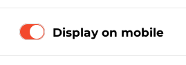
Model example:
{
  "type": "CONTROL",
  "name": "DISPLAY",
  "elementProp": "styleAttributes",
  "elementSubProp": "display",
  "element": "host",
  "params": {
    "label": "Display on mobile"
  }
}
Component outputs following data: string
Data example:
{
  display: 'none';
}
Full reference: Display
Component Options
Configures options for dropdowns, radio buttons, and similar widget components.
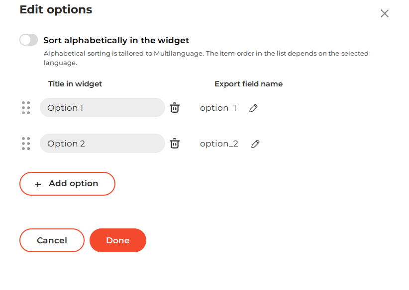
Model example:
{
  "type": "CONTROL",
  "name": "COMPONENT_OPTIONS",
  "params": {
    "label": "Export ID",
    "header": "Options",
    "origin": true,
    "optionsPropPath": ["control", "options"],
    "optionsAlphabeticSortPropPath": ["control", "optionsAlphabeticSort"],
    "integrationNamePropPath": ["control", "integrationName"]
  }
}
Component outputs following data:
{
  options: ComponentOptionsI;
  optionsAlphabeticSort: AlphabeticSortI;
}

interface ComponentOptionsI {
  [key: string]: ComponentOptionI;
}

export interface ComponentOptionI {
  id: string;
  exportId: string;
  label: string;
  sort: number;
}

interface AlphabeticSortI {
  enabled: boolean;
}
Data example:
{
  "options": {
    "option_1": {
      "exportId": "option_1",
      "label": "Option 1",
      "id": "option_1",
      "sort": 0
    },
    "option_2": {
      "exportId": "option_2",
      "label": "Option 2",
      "id": "option_2",
      "sort": 1
    }
  },
  "optionsAlphabeticSort": {
    "enabled": false
  }
}
Full reference: Component options
Icon Select
Allows selection of predefined icons or uploading custom icons.
Predefined icons that are inline SVGs can be further customized with the color picker.
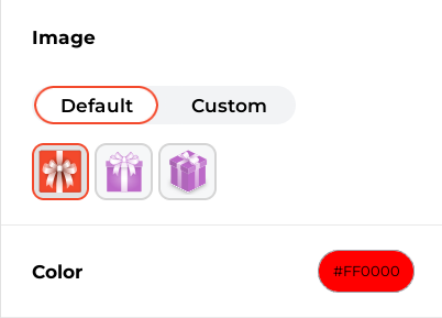
Model example:
  {
  "type": "CONTROL",
  "name": "ICON_SELECT",
  "propPath": [
    "content",
    "cardImage"
  ],
  "params": {
    "label": "Image",
    "excludeImageTypes": ["gif"],
    "options": [
      {
        icon: 'SVG CODE',
        inlineSvg: true,
        value: 'icon-name1'
      },
      {
        icon: 'https://example.com/image.jpg',
        inlineSvg: false,
        value: 'icon-name2'
      }
    ],
    enableCustomIcons: true
  }
}
Component outputs following data:
{
  iconContent: string;
  defaultIcon: boolean;
  color: string;
}
Data example:
{
  iconContent: 'icon-name1',
  defaultIcon: true,
  color: 'rgba(46, 134, 109, 1)'
}
Full reference: Icon select
Integration Field Mapping
Configures field mapping for integrations. See Contact fields mapping configuration for details.
Model example:
 {
  "type": "CONTROL",
  "name": "INTEGRATION_FIELD_MAPPING",
  "params": {
    "integrationNamePropPath": ["control", "integrationName"],
    "groupNamePropPath": ["control", "groupName"],
    "fieldNamePropPath": ["control", "fieldName"],
    "fieldTypePropPath": ["control", "fieldType"],
    "validationPropPath": ["control", "validation"],
    "placeholderPropPath": ["content", "placeholder"],
    "labelPropPath": ["content", "label"],
    "optionsPropPath": ["control", "options"],
    "optionsAlphabeticSortPropPath": ["control", "optionsAlphabeticSort"]
  }
}
Component outputs following data:
{
  "integrationName": string;
  "groupName": string;
  "fieldName": string;
  "fieldType": string;
  "options": ComponentOptionsI;
}

interface ComponentOptionsI {
  [key: string]: ComponentOptionI;
}
Data example:
{
  "integrationName": "text_field_id_4",
  "groupName": "Main",
  "fieldName": "Text",
  "fieldType": "text",
  "options": {}
}
Full reference: Integration field mapping
List Position
Controls the direction of checkbox or radio lists along with alignment and offsets.
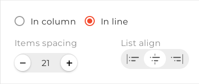
Model example:
{
  "type": "CONTROL",
  "name": "LIST_POSITION",
  "elementProp": "styleAttributes",
  "element": "listContainer"
}
Component outputs following data:
{
  flexDirection: string;
  alignItems: string;
  justifyContent: string;
  gap: string;
}
Data example:
{
  alignItems: "start",
  flexDirection: "row",
  gap: "21px",
  justifyContent: "center"
}
Doesn't have additional parameters.
Insert Block
Allows inserting or updating links, merge tags, or text rollers within text.
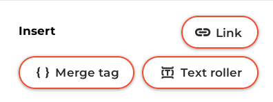
Model example:
{
  "type": "CONTROL",
  "name": "INSERT_BLOCK",
  "params": [
    {
      "element": "text",
      "label": "DOCUMENT_TEXT",
      "isLinkAvailable": true,
      "origin": true
    }
  ]
}
Full reference: Insert block
Prize Settings
Controls prize settings for gamified components.
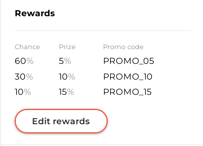
Model example:
 {
  "type": "CONTROL",
  "name": "PRIZE_SETTINGS",
  "propPath": [
    "content",
    "prize"
  ],
  "params": {
    "minOptions": 2,
    "prizeImageEnabled": false,
  }
}
Full reference: Prize settings