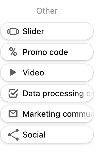
Left panel component icon customization
Technical specifications for creating SVG icons for Claspo components
Technical Requirements
Dimensions
- Canvas size: 20x20 px
- ViewBox:
0 0 20 20 - Format: SVG
SVG Structure
<svg width="20" height="20" viewBox="0 0 20 20" fill="none" xmlns="http://www.w3.org/2000/svg">
  <path fill-rule="evenodd" clip-rule="evenodd" d="..." fill="#5F5F5F"/>
</svg>
Style Requirements
- Fill color:
#5F5F5F - Graphics type: Filled shapes (not strokes)
- Fill-rule:
evenodd - Clip-rule:
evenodd - Minimum element thickness: 2px for readability
- Padding from edges: 2-3px
- Composition: Centered
Code Requirements
- Use
<path>elements - Single or multiple paths allowed
- Clean SVG code without unnecessary attributes
- All paths must use the same fill color
Editor Integration
To display the icon in the editor's left panel (component library), you need to:
- Place the SVG file in the component's
assets/img/folder - Reference it in the manifest using
metaDescription.icon
File Structure
YourComponent/
├── assets/
│   └── img/
│       └── your-component-icon.svg
├── YourComponent.manifest.js
└── ...
Manifest Configuration
export default {
  "name": "YourComponent",
  // ... other manifest properties
  "metaDescription": {
    "icon": "/YourComponent/assets/img/your-component-icon.svg",
    "label": {
      "en": "Your Component",
    }
  }
}
Note: The icon path is relative to the components root directory and starts with
/.